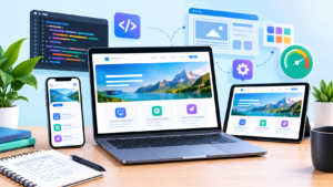
Learn how professional Website Design and Development combines UX, responsive design, technical SEO, accessibility, performance, security, content strategy, and conversion optimization to build high-performing websites.
Introduction
A modern website is much more than a collection of attractive pages. It is a digital environment where potential customers discover a business, evaluate its credibility, consume information, compare solutions, and decide whether to take action. Effective Website Design and Development therefore requires a strategic combination of visual design, user experience, technical architecture, content, search optimization, accessibility, security, performance, and ongoing improvement.
A website can look impressive and still fail commercially. It may have beautiful graphics but confusing navigation, persuasive copy but slow loading times, sophisticated functionality but poor mobile usability, or excellent content that search engines struggle to crawl. The strongest websites take a broader view: every design and development decision should contribute to a useful experience for visitors while supporting measurable business objectives.
This is especially important as websites increasingly serve multiple purposes simultaneously. A business website may function as a brand platform, lead-generation system, publishing environment, sales channel, customer-support resource, recruitment platform, and search visibility asset. The technology and design must therefore be flexible enough to support different users and business requirements without becoming unnecessarily complicated.
Google’s official SEO Starter Guide explains that SEO helps search engines crawl, index, and understand content. Google’s Search Essentials likewise provides foundational guidance for making content accessible to Google Search. These resources reinforce an important principle: a successful website is not created by manipulating search engines. It is created by building an accessible, technically sound, useful experience that helps people accomplish their goals.
This guide explores the complete website design and development process, from strategy and information architecture to responsive development, technical SEO, accessibility, performance, security, testing, conversion optimization, and long-term maintenance.
Understanding What Professional Website Design and Development Really Means
Professional Website Design and Development combines two closely connected disciplines. Website design focuses on how an experience looks, feels, communicates information, and guides users through an interface. Development turns that experience into a functioning digital product using technologies such as HTML, CSS, JavaScript, databases, APIs, content management systems, and server infrastructure. Although these responsibilities may be divided among different specialists, the final website succeeds only when the disciplines work together.
Design should never be treated as decoration placed on top of technology. A designer must understand the user’s goals, the content hierarchy, the available functionality, accessibility requirements, responsive behavior, and the practical limitations of the chosen platform. Likewise, developers need to understand why a component exists, what user problem it solves, how it should behave on different devices, and which parts of the experience are essential. When design and development operate in isolation, inconsistencies and unnecessary compromises become much more likely.
The strongest websites are also designed for long-term usefulness. A site should be easy to maintain, reasonably scalable, secure, accessible, and adaptable as business requirements change. Reusable components, logical templates, structured content, clean navigation, maintainable code, documented integrations, and sensible deployment processes can significantly reduce future development costs. This is why website development should be viewed as an ongoing product discipline rather than a one-time technical project.
A successful website should ultimately accomplish several things simultaneously: communicate a clear value proposition, make important information easy to find, provide intuitive navigation, work across devices, load efficiently, protect users, support search-engine discovery, and encourage appropriate actions. Google’s documentation on SEO emphasizes making websites easier for search engines to crawl, index, and understand rather than relying on isolated ranking tricks.
For businesses, this broader approach creates a more durable digital asset. Instead of building a website simply because competitors have one, organizations can create an online platform that genuinely supports marketing, sales, customer education, reputation, and long-term growth.
Starting With Website Strategy, Audience Research, and Business Objectives
One of the biggest mistakes in website projects is beginning with visual design before establishing a clear strategy. Teams may immediately discuss colors, logos, fonts, animations, and page layouts without first answering fundamental questions about the website’s purpose. A professional process begins by identifying who the website serves, what those users need, what the business wants to accomplish, and what actions should occur after visitors arrive.
Audience research provides the foundation for these decisions. Different audiences have different expectations, questions, objections, and levels of knowledge. A B2B consultancy may need detailed service explanations, case studies, credentials, methodology, and consultation opportunities. An e-commerce business may need product comparisons, reviews, shipping information, inventory status, and a frictionless checkout process. A local service provider may need location information, opening hours, reviews, directions, service areas, and immediate contact options.
The website should therefore be designed around user intent rather than internal company structure alone. Businesses often organize websites according to how their departments operate, but customers do not necessarily think in those categories. Visitors are more likely to ask questions such as “Can this company solve my problem?”, “How much does this cost?”, “Is this trustworthy?”, “How does the process work?”, or “What should I do next?” The website structure and content should make these answers easy to discover.
Business objectives should also be measurable. “Get more traffic” is too broad to guide effective development. More useful objectives might include increasing qualified enquiries, improving product sales, generating consultation requests, increasing registrations, encouraging downloads, reducing support requests, or increasing repeat purchases. These objectives influence page structure, calls to action, forms, analytics events, content strategy, and conversion paths.
A useful planning exercise is to identify primary and secondary conversions. A primary conversion might be submitting a quotation request, while a secondary conversion could be downloading a guide or subscribing to an email list. This creates multiple opportunities for users who are at different stages of the buying journey.
Businesses that already have an established content strategy can also connect website architecture with Digital Marketing. This ensures the website is not developed as an isolated asset but as part of a broader acquisition and customer-journey system.
The result should be a clear project brief containing audience profiles, business goals, core user journeys, content requirements, functionality requirements, technical constraints, and success metrics. This strategic foundation prevents design decisions from becoming subjective and gives every later stage of development a measurable purpose.
Building a Logical Information Architecture and Website Structure
Information architecture determines how a website’s content is organized, labeled, connected, and presented. Visitors may never use the term “information architecture,” but they experience it whenever they navigate a menu, search for a service, follow an internal link, read breadcrumbs, or move from a broad category to a specific page.
A logical website structure reduces friction. Important pages should be easy to discover, categories should make sense, and navigation labels should communicate what users will find after clicking. A website with dozens of unrelated navigation items can overwhelm visitors, while an overly simplified structure may hide valuable information. The objective is to create enough hierarchy to organize content without forcing visitors through unnecessary layers.
A practical architecture can begin by identifying the site’s major content groups. For a professional services company, these might include services, industries, resources, company information, and contact options. Each major category can then contain relevant subpages. Related resources should connect naturally to service pages, and supporting content should guide users toward appropriate next steps.
URL structure should reflect this organization where practical. Clean, understandable URLs are easier for people to interpret and can provide additional context about page relationships. Internal linking should reinforce the same hierarchy. Instead of linking randomly between pages, connect related topics where the relationship is genuinely useful.
Google’s official guidance on crawlable links states that descriptive anchor text helps people and Google understand the destination of a link. This makes internal linking both a usability practice and an important technical consideration.
For example, a page explaining page performance could naturally link to a more detailed resource using the exact anchor Core Web Vitals if that destination genuinely discusses those metrics. A service page discussing content strategy could link to an appropriate article using the exact phrase Content Marketing where context supports it. The anchor should describe the destination rather than being artificially optimized.
A strong architecture also considers future growth. If a website is expected to publish hundreds of articles, product pages, case studies, or resources, the structure should be able to accommodate them without becoming chaotic. Content categories, tags, templates, filters, pagination, and search functionality should be planned according to actual requirements.
The ultimate goal is simple: users should be able to predict where information belongs and how to reach it. When the structure is intuitive, visitors find answers faster, search engines can discover important URLs more efficiently, and the website becomes easier to expand and maintain.
Creating Wireframes Before Final Visual Design
Wireframing is one of the most valuable stages in a professional website project because it allows teams to solve structural problems before investing heavily in visual production. A wireframe focuses primarily on hierarchy, content placement, navigation, functionality, and user flow rather than decorative details.
A homepage wireframe, for example, might establish the sequence of the value proposition, primary services, trust signals, supporting content, customer evidence, and calls to action. A service page could define the order of the introduction, problem explanation, solution details, benefits, process, proof, FAQs, and conversion opportunity. An e-commerce product page might prioritize product imagery, price, availability, specifications, reviews, shipping information, and purchasing controls.
The most important principle is that wireframes should reflect actual user journeys. A page should not contain sections merely because a competitor has them or because they look attractive in a design template. Each section should answer a question, reduce uncertainty, communicate value, establish trust, or help the visitor take an appropriate next step.
Wireframes also make mobile planning easier. A complex desktop navigation may need a completely different interaction model on a smartphone. Wide comparison tables may require horizontal scrolling or an alternative mobile presentation. Large hero sections may need reduced heights. Multi-column layouts may need to become stacked sections.
Google’s mobile-first indexing guidance recommends mobile-friendly experiences and identifies responsive design as a supported approach. Google uses the mobile version of a site’s content for indexing and ranking, making it particularly important that the mobile experience contains the important content and functionality users need.
Wireframes should therefore be reviewed at multiple viewport sizes before visual design is finalized. Teams can ask practical questions:
- Is the main purpose immediately understandable?
- Can users find the primary navigation?
- Is the primary call to action visible at the appropriate point?
- Does the content order make sense?
- Are important trust signals included?
- Can the page be comfortably used on a small screen?
- Are forms and interactive elements positioned logically?
Solving these questions in wireframes is considerably cheaper than solving them after development.
A good wireframe becomes a communication tool between strategists, designers, copywriters, developers, and stakeholders. It creates a shared understanding of the page before aesthetic decisions begin and helps ensure that design follows content and user needs rather than forcing content into a predetermined visual layout.
Designing a Consistent Visual System for Brand, UX, and Accessibility
A website’s visual system should create clarity and consistency. Rather than designing every page independently, professional teams establish reusable rules for typography, spacing, colors, buttons, cards, forms, navigation, icons, imagery, alerts, and interaction states. This creates a recognizable interface and makes the site easier to maintain.
Typography is especially important because it affects readability and hierarchy. A clear typographic scale allows visitors to distinguish primary headings, supporting headings, body text, labels, captions, and interface controls. Line height, paragraph spacing, font weight, character width, and content width all influence reading comfort.
Color should similarly have a functional role. Primary brand colors may establish identity, while supporting colors communicate states such as success, warning, error, or interaction. However, visual consistency should never come at the expense of accessibility. Text must remain readable, interactive controls must be identifiable, and important information should not rely exclusively on color.
Accessibility should be included in the design system from the beginning. The official web.dev accessibility guidance covers accessible navigation, semantic HTML, forms, focus states, tap targets, labels, and text alternatives. These practices help users with disabilities interact with websites while often improving usability for everyone.
For example, a clearly visible keyboard focus state benefits keyboard users. Properly labeled form fields help screen-reader users but also make forms easier to understand visually. Adequate button sizing benefits people with motor difficulties while also improving mobile usability. Clear error messages reduce confusion for all visitors.
The visual system should also define interaction states before development. Buttons may have default, hover, focus, active, disabled, and loading states. Form fields may need default, focused, completed, error, and success states. Navigation elements may require expanded or collapsed states on mobile.
This level of planning creates a design system rather than a collection of disconnected page designs.
A design system also improves development efficiency. Developers can build reusable components instead of repeatedly creating slightly different versions of the same interface element. Future pages can then use established patterns, reducing inconsistencies and shortening production time.
The best visual systems are not necessarily the most elaborate. They are the ones that make the interface predictable, communicate hierarchy clearly, reinforce brand identity, and remain accessible across different devices and user circumstances.
Choosing the Right Website Technology and Development Approach

Technology selection should be based on requirements rather than popularity. A website does not automatically become better because it uses the newest framework or the most complex architecture. The correct technology depends on the site’s content, functionality, integrations, expected traffic, publishing workflow, security requirements, development resources, and long-term maintenance needs.
A content-focused business website may benefit from a capable content management system that allows non-technical staff to publish and update pages. A highly interactive application may require a custom front-end and back-end architecture. An e-commerce business may need specialized product management, payment processing, inventory integration, shipping functionality, customer accounts, taxation logic, and order management.
The key principle is appropriate complexity. Additional technologies create additional dependencies, maintenance responsibilities, security considerations, and opportunities for failure. A sophisticated architecture can be justified when it solves a genuine business problem, but unnecessary complexity can increase costs without improving the user experience.
Development standards are equally important. Professional projects should normally use version control, staging environments, documented configuration, reusable components, controlled dependencies, clear coding conventions, testing procedures, and repeatable deployment processes.
Performance should influence technology decisions from the beginning. A site can become unnecessarily slow through excessive JavaScript, oversized libraries, third-party scripts, inefficient rendering, unoptimized media, or unnecessary client-side processing. Developers should evaluate whether a feature genuinely requires a large dependency or whether a lighter implementation can achieve the same result.
The official web.dev performance audit guidance recommends establishing a performance baseline and using tools such as Lighthouse, Chrome DevTools, and PageSpeed Insights to identify opportunities for improvement. It also emphasizes measuring real-world conditions rather than assuming that a site performs well simply because it works on a developer’s machine.
Technology choices should also consider maintainability. Ask:
- Who will update the website?
- Who will maintain dependencies?
- How will security updates be handled?
- How easily can new pages be created?
- Can components be reused?
- What happens if a third-party service changes?
- How will backups and recovery work?
- Can another developer understand the system later?
These questions are often more important than which framework appears most fashionable.
The strongest development approach is one that creates a reliable balance between performance, flexibility, security, maintainability, development speed, and business requirements.
Developing Responsive and Mobile-First Website Experiences
Responsive design ensures that a website adapts naturally to different screen sizes and interaction environments. Modern visitors may access the same website through smartphones, tablets, laptops, desktop monitors, and high-resolution displays. The interface therefore needs to respond to changing viewport dimensions without sacrificing usability.
Responsive development involves more than adding a few CSS breakpoints. Layouts should use flexible containers, scalable media, appropriate typography, adaptable spacing, and components that change behavior when necessary. A desktop navigation might become a mobile menu. A multi-column section may stack vertically. A wide table may require a carefully designed mobile presentation. Large images may need different dimensions and delivery strategies.
Mobile-first development encourages teams to prioritize essential information. Instead of beginning with a large desktop canvas and attempting to remove elements later, the design starts with the constraints of smaller screens and expands as space becomes available. This often results in cleaner interfaces because the team must determine which content and functionality genuinely matter.
Google’s mobile-first indexing documentation explains that Google uses the mobile version of website content for indexing and ranking. This means developers should ensure that important content, links, structured information, and functionality are available on the mobile experience.
Responsive testing should include real interaction scenarios. Check:
- Navigation menus
- Search functionality
- Forms
- Buttons
- Tables
- Images
- Embedded videos
- Sliders
- Sticky headers
- Pop-ups
- Checkout processes
- Account areas
- Interactive components
A website can appear responsive while still creating serious usability problems. Buttons may be too small, text may become difficult to read, sticky elements may cover content, forms may be awkward to complete, and horizontal scrolling may appear unexpectedly.
Performance is also especially important on mobile networks. A page that feels acceptable on a fast desktop connection may feel extremely slow on a mobile device with limited bandwidth or processing power.
Therefore, responsive design should combine layout adaptation, interaction design, accessibility, performance, and content prioritization.
A strong mobile experience should not feel like a compromised version of the desktop website. It should feel deliberately designed for the context in which users are accessing it.
Integrating Technical SEO Into Website Development
Technical SEO should be incorporated into website development from the beginning rather than treated as an emergency project after launch. Search engines need to discover pages, crawl resources, interpret content, understand relationships between URLs, and determine which pages should be indexed. Development decisions can either support or obstruct those processes.
Important technical foundations include logical URLs, crawlable navigation, appropriate status codes, descriptive page titles, meaningful headings, canonicalization where appropriate, XML sitemaps when useful, robots directives, accessible content, and appropriate internal linking. These elements should work together rather than being implemented as isolated checklist items.
Google’s SEO documentation provides guidance for helping search engines crawl, index, and understand websites. The official Search Essentials resources also establish fundamental requirements and best practices for appearing in Google Search.
One frequent development mistake is assuming that everything visible in a browser is automatically accessible to search engines. Important content can become difficult to discover when navigation depends on unsupported implementations, critical information is hidden unnecessarily, or rendering creates technical barriers.
Internal links should use normal crawlable HTML links wherever possible. Google’s link best practices specifically explain that Google generally discovers links through crawlable anchor elements and recommends descriptive, concise anchor text.
For example, if another page genuinely explains SEO strategy, the exact anchor Search Engine Optimization can be linked to that relevant resource. If a page discusses digital growth, the exact anchor Digital Marketing can point to a relevant guide. This is more useful than repeatedly using generic anchors such as “read more.”
Technical SEO should also include appropriate handling of redirects when URLs change. A redesign can unintentionally create hundreds of broken URLs if old addresses are replaced without mapping them to relevant destinations. Search visibility can suffer, while visitors may encounter unnecessary 404 pages.
The development team should therefore create a technical SEO checklist before launch covering:
- URL structure
- Crawlability
- Indexation controls
- Internal links
- Redirects
- Canonical URLs
- XML sitemap
- Robots directives
- Metadata
- Structured data where appropriate
- Mobile content parity
- Image accessibility
- Page performance
- HTTPS
- Search Console verification
Technical SEO is most effective when it becomes part of the website’s architecture rather than a collection of fixes added after the website has already been built.
Improving Website Performance and Core Web Vitals
Website performance is one of the most important qualities of a modern digital experience. Visitors expect pages to load quickly, respond smoothly, and remain visually stable while content appears. When a page is slow or difficult to interact with, users may leave before discovering the site’s value. For businesses, that can mean lost enquiries, abandoned purchases, lower engagement, and weaker customer satisfaction. Professional Website Design and Development should therefore treat performance as a core product requirement rather than something to address only after launch.
Performance optimization begins with measurement. Developers should establish a baseline and identify which resources consume the most bandwidth, processing time, or rendering effort. Large images are a frequent source of unnecessary weight, particularly when a high-resolution image is delivered to a small mobile screen. Images should be appropriately sized and compressed, while modern formats can be considered when browser and project requirements support them. JavaScript should also be reviewed carefully because excessive client-side processing can delay interactivity. Third-party scripts for analytics, advertising, chat, social widgets, and other services should be evaluated according to their actual business value.
Google’s Core Web Vitals focus on important aspects of user experience, including loading performance, interaction responsiveness, and visual stability. The current Core Web Vitals are Largest Contentful Paint (LCP), Interaction to Next Paint (INP), and Cumulative Layout Shift (CLS). (developers.google.com) These measurements should be used as diagnostic indicators rather than treated as the entire definition of a high-quality website.
A practical performance workflow can include PageSpeed Insights, Lighthouse, Chrome DevTools, server logs, and real-user monitoring where appropriate. These tools can reveal problems involving image delivery, render-blocking resources, JavaScript execution, caching, network requests, layout shifts, and server response times. The official web performance guidance also provides practical recommendations for improving loading and responsiveness. (web.dev)
Caching can further reduce unnecessary requests. Static resources such as stylesheets, JavaScript files, fonts, and images can often be cached appropriately so returning visitors do not need to download everything repeatedly. Content delivery networks can also help distribute assets geographically when a website serves users across multiple regions.
However, performance optimization should always preserve functionality. Removing a useful feature simply because it consumes resources may not be the right business decision. Instead, teams should determine whether the feature can be implemented more efficiently. The goal is to create a website that loads quickly, becomes usable quickly, responds reliably, and remains visually stable while delivering the functionality users actually need.
Making Accessibility a Core Part of Website Development
Accessibility is an essential component of professional web development because people interact with websites in many different ways. Some users rely on screen readers, keyboard navigation, voice control, magnification, alternative input devices, or other assistive technologies. Others may experience temporary or situational limitations. A website designed with accessibility in mind can provide a better experience across a much wider audience.
One of the strongest foundations for accessibility is semantic HTML. Headings should represent meaningful hierarchy, navigation should be identified appropriately, buttons should behave like buttons, links should function as links, and form controls should have clear labels. Developers should avoid replacing standard browser functionality with custom components unless there is a genuine reason to do so. Native HTML elements already provide significant accessibility behavior, reducing unnecessary implementation complexity.
The official web.dev accessibility guidance recommends practices involving semantic HTML, keyboard accessibility, focus management, accessible forms, navigation, text alternatives, and interactive controls. (web.dev) These principles should be included during design and development rather than postponed until the final quality-assurance phase.
Images also require thoughtful treatment. Decorative images generally should not create unnecessary noise for assistive technology, while informative images need meaningful alternative text. The objective is not to describe every visual detail mechanically; the objective is to communicate the information or purpose that the image contributes to the page.
Forms are another important area. A visually obvious form field may not be understandable to a screen-reader user if it has no proper label. Error messages should explain what went wrong and how to correct it. Focus should move predictably through interactive controls. Keyboard users should be able to reach every important action without becoming trapped inside a component.
Color contrast also matters. Text should remain readable against its background, and important states should not be communicated through color alone. For example, an error message should not simply turn a field border red; it should provide meaningful text explaining the problem.
Accessibility improvements frequently benefit all visitors. Clear headings improve scanning, descriptive links improve navigation, readable typography improves comprehension, visible focus states help keyboard users, and properly structured forms reduce errors.
Therefore, accessibility should be viewed as a quality characteristic of the entire website, not a separate technical feature. When accessibility is integrated into the design system, content workflow, component library, and testing process, it becomes much easier to maintain as the website grows.
Protecting Websites With Strong Security Practices
Security is a fundamental responsibility in website development. A compromised website can expose user information, damage a company’s reputation, disrupt business operations, inject malicious content, or create serious financial and legal consequences. Security therefore needs to be considered from the earliest architectural decisions through development, deployment, monitoring, and maintenance.
One of the basic foundations is HTTPS. A secure connection helps protect information transmitted between users and the website. The official web.dev HTTPS guidance explains the role of encryption in protecting web communication. (web.dev) Websites should ensure that pages, scripts, stylesheets, images, APIs, and other important resources are served securely without unnecessary mixed-content problems.
Authentication deserves particular attention. Administrative accounts should use strong credentials and appropriate multi-factor authentication where supported. Permissions should follow the principle of least privilege, meaning users and systems receive only the access they genuinely need. A content editor does not necessarily require administrative access to hosting infrastructure, databases, or payment systems.
Software dependencies should also be maintained. Outdated plugins, frameworks, libraries, CMS components, and server software may contain known vulnerabilities. However, updates should be managed carefully through staging, testing, backups, and controlled deployment rather than blindly updating production systems without verification.
Input handling is another critical area. Forms, search fields, file uploads, account systems, and API endpoints should be developed with appropriate validation and security controls. Sensitive information should not be exposed unnecessarily in client-side code, public repositories, URLs, or logs.
Backups are equally important. A backup is only useful if it can actually be restored. Businesses should establish appropriate backup frequency, retention policies, storage separation, and restoration procedures. Critical websites should periodically test recovery rather than assuming that backup files will work when needed.
Monitoring adds another layer of protection. Security alerts, unusual login activity, unexpected file changes, server errors, and suspicious traffic patterns can provide early warning of problems.
A professional security strategy therefore combines secure coding, secure infrastructure, access controls, updates, backups, monitoring, encryption, and incident response.
Security should never be considered “finished.” New vulnerabilities, software releases, integrations, and operational changes continuously alter the risk environment. Long-term security requires ongoing attention.
Creating SEO-Friendly Content, Metadata, and Internal Links
A technically strong website still needs useful content. Search engines can discover a page perfectly and still have little reason to recommend it if the content is shallow, unclear, outdated, or irrelevant to the user’s needs. Content strategy and website development should therefore work together from the beginning.
Every important page should have a clear purpose. A service page should explain what the service does, who it is for, what problem it solves, why the organization is qualified to provide it, and what the next step should be. An educational article should answer a meaningful question comprehensively rather than repeating a keyword across multiple paragraphs.
Google’s official Creating Helpful, Reliable, People-First Content guidance emphasizes creating content primarily for people rather than producing material solely to attract search traffic. (developers.google.com) This aligns closely with E-E-A-T principles: useful content should demonstrate appropriate experience, expertise, authority, and trustworthiness.
Page titles and descriptions should accurately describe the page. Headings should establish hierarchy rather than merely providing visual decoration. Content should be easy to scan using meaningful subheadings, concise paragraphs, lists, tables where appropriate, and supporting visuals.
Internal links are also valuable. A website should connect related pages where the connection genuinely helps the visitor. Google’s crawlable links guidance recommends concise, descriptive anchor text that helps users and search engines understand the linked page. (developers.google.com)
This is where exact-match contextual linking can be implemented naturally. If a page discusses optimization for organic visibility, the exact anchor Search Engine Optimization can link to a relevant SEO resource. If a page discusses broader online growth, the exact anchor Digital Marketing can link to an appropriate guide. The anchor should accurately represent the destination.
Avoid forcing keywords into every possible link. Repetition can make content feel unnatural and can reduce usability. Internal links should primarily help readers discover useful information.
External references can also improve trust when they point toward authoritative documentation. For technical subjects, Google’s own documentation and web.dev resources are particularly useful because readers can verify recommendations directly.
Ultimately, SEO-friendly website content should answer the user’s question clearly, demonstrate real knowledge, provide useful supporting details, and make the next relevant piece of information easy to discover.
Designing Conversion-Focused User Journeys
A website can receive substantial traffic and still generate poor business results if visitors cannot easily understand what to do next. Conversion-focused design addresses this problem by aligning page structure, content, trust signals, calls to action, forms, and user journeys with visitor intent.
The first step is understanding that not every visitor is ready to buy. Someone discovering a company for the first time may need educational content before contacting the business. Another visitor may already understand the problem and simply need pricing, proof, or a consultation form. The website should accommodate different stages rather than forcing every visitor toward the same action.
Calls to action should therefore be relevant to context. A service page might encourage a consultation, while an educational article might encourage the reader to explore a related guide. A product page may prioritize purchase, while a comparison page may encourage users to review detailed specifications.
Trust is particularly important for conversion. Visitors may ask whether the organization is experienced, whether the service is legitimate, whether other customers achieved results, whether the process is transparent, and whether their information will be protected. Relevant testimonials, case studies, credentials, clear contact details, policies, transparent processes, and genuine evidence can reduce uncertainty.
Forms should also be carefully designed. Long forms can create unnecessary friction, especially when users are only at an early stage of the buying process. Ask for information that is genuinely useful at that stage. If additional information is required later, it can often be collected after initial contact.
The visual hierarchy should support the conversion path without becoming aggressive. Every section does not need a bright button. Too many competing calls to action can actually reduce clarity. Instead, establish a primary action and use secondary actions where they genuinely help.
Analytics can reveal where visitors struggle. If many people reach a form but abandon it, the form may contain unnecessary fields or confusing instructions. If visitors leave quickly from a service page, the value proposition or content structure may need improvement. If users repeatedly visit a pricing page before contacting the company, pricing information may be an important decision factor.
Conversion optimization is therefore best understood as removing unnecessary friction between user intent and useful action.
A successful website does not manipulate users into clicking. It makes the correct next step obvious, credible, accessible, and easy.
Testing, Launching, Measuring, and Maintaining a Website
The launch of a website should represent the beginning of its operational life, not the end of development. Before launch, the project should pass a structured quality-assurance process covering functionality, responsive behavior, accessibility, SEO, performance, security, analytics, forms, redirects, and content accuracy.
Functional testing should verify every important interaction. Navigation menus, search, forms, account functionality, buttons, downloads, videos, filters, checkout processes, and third-party integrations should be tested under realistic conditions.
SEO checks should confirm that important pages can be discovered and indexed appropriately. Review titles, headings, canonical URLs, internal links, redirects, robots directives, XML sitemaps, structured data where applicable, and mobile content. Google provides Search Console as a tool for monitoring a site’s presence and performance in Google Search.
Analytics implementation should also be tested before launch. Events should record meaningful actions such as form submissions, purchases, downloads, registrations, or other important business outcomes. Incorrect analytics can lead to poor decisions because stakeholders may optimize based on unreliable data.
Performance should be tested across realistic devices and connection conditions. A site that performs well on a developer’s high-end desktop may behave differently on a lower-powered smartphone.
After launch, maintenance becomes essential. Websites need software updates, security reviews, content revisions, broken-link checks, performance monitoring, backup verification, analytics reviews, and periodic UX improvements.
Search performance should also be monitored rather than assumed. Changes in rankings or traffic can result from technical changes, content changes, search behavior, competition, algorithm updates, seasonality, or changes in user intent. Data should be interpreted carefully.
A maintenance schedule can include:
- Weekly: uptime and critical-error monitoring
- Monthly: security updates, analytics review, broken-link checks
- Quarterly: content and UX review
- Every major release: regression and compatibility testing
- Periodically: technical SEO and performance audits
- Continuously: backup and security monitoring
A website that receives regular attention is much easier to improve than one that is ignored for years and then requires a complete emergency rebuild.
Building a Long-Term Website Growth and Optimization System
A high-quality website should evolve with the organization. Customer expectations change, competitors introduce new experiences, technology develops, search behavior changes, and businesses add new products or services. A website that never changes can gradually become less useful even if its original design was excellent.
Long-term optimization should begin with evidence. Analytics can reveal which pages attract visitors, where users abandon journeys, which content contributes to conversions, and which pages receive little engagement. Search data can reveal questions users ask and topics where the website has opportunities to provide stronger information. Customer-support teams can identify recurring questions that deserve better website content.
Performance data can identify technical bottlenecks. Accessibility audits can reveal barriers. Security monitoring can uncover vulnerabilities. Sales teams can identify objections that should be addressed through case studies, FAQs, pricing explanations, or clearer service pages.
This creates a continuous improvement cycle:
Measure → Identify → Prioritize → Test → Implement → Measure Again
Prioritization is important because not every problem deserves immediate attention. A small visual inconsistency may be less important than a broken conversion form or a security vulnerability. Teams should evaluate issues based on impact, effort, risk, and strategic value.
Content should also be maintained. Old articles may contain outdated statistics, broken links, obsolete recommendations, or information that no longer reflects the organization’s services. Updating valuable content can improve usefulness while removing or consolidating low-value pages can simplify the website.
Google’s people-first content guidance supports the principle of creating content that genuinely serves an audience rather than publishing large quantities of material solely for search visibility. (developers.google.com)
A long-term website strategy should also preserve technical quality. New plugins, scripts, integrations, templates, and content types should be evaluated before being added. Every new feature introduces potential maintenance and performance costs.
The best websites are therefore treated as living digital products. They are continuously measured, maintained, improved, and aligned with business objectives rather than being considered complete once the initial launch has occurred.
Common Mistakes in Website Design and Development

1. Designing Before Understanding the Audience
A beautiful interface cannot compensate for a website that does not address user needs. Begin with audience research, user journeys, business goals, and content requirements.
2. Treating Mobile as an Afterthought
A desktop-first design that is simply compressed for mobile often creates poor navigation, oversized elements, and difficult forms. Responsive behavior should be planned during wireframing and visual design.
3. Ignoring Website Speed
Large images, unnecessary JavaScript, excessive animations, inefficient hosting, and third-party scripts can slow down pages. Performance should be measured throughout development rather than only after launch.
4. Using Too Many Plugins or Dependencies
Every plugin or dependency introduces potential maintenance, security, compatibility, and performance considerations. Use technology because it solves a genuine requirement.
5. Creating Confusing Navigation
Visitors should not have to understand the company’s internal organizational structure to find information. Navigation should reflect user expectations.
6. Writing Content for Search Engines Instead of People
Keyword repetition does not automatically create useful content. Google’s people-first content guidance recommends prioritizing content created to benefit people. (developers.google.com)
7. Using Generic Internal-Link Anchors
Phrases such as “click here” provide little context. Use descriptive anchor text that accurately represents the destination, following Google’s link best practices. (developers.google.com)
8. Ignoring Accessibility
Accessibility problems can prevent people from using important parts of a website. Build semantic HTML, keyboard navigation, labels, focus states, and readable interfaces into the project from the beginning.
9. Launching Without Redirect Planning
Website redesigns often change URLs. Failing to map important old URLs to relevant new destinations can create broken experiences and unnecessary SEO problems.
10. Forgetting Post-Launch Maintenance
A website requires updates, monitoring, security maintenance, content improvements, and performance optimization throughout its lifecycle.
Best Practices Summary
A professional website development strategy should follow these core principles:
- Start with strategy before design.
- Understand your audience and user intent.
- Create a logical information architecture.
- Use wireframes to solve structural problems early.
- Develop a consistent design system.
- Build accessibility into every component.
- Use responsive design from the beginning.
- Choose technology based on actual requirements.
- Integrate technical SEO into development.
- Use descriptive internal-link anchor text.
- Create original, useful, people-first content.
- Optimize images, scripts, fonts, and other assets.
- Monitor Core Web Vitals and real-world performance.
- Protect websites with HTTPS and strong security practices.
- Test forms, navigation, redirects, analytics, and integrations before launch.
- Measure meaningful business outcomes.
- Maintain and improve the website continuously.
Google’s Search Essentials and SEO Starter Guide provide useful foundations for creating technically accessible, search-friendly websites. (developers.google.com)
Frequently Asked Questions
1. What is Website Design and Development?
Website Design and Development is the combined process of planning, designing, building, testing, launching, and maintaining a website. Design covers visual presentation, user experience, layout, navigation, typography, and interaction. Development covers the technical implementation, including front-end code, back-end functionality, databases, integrations, hosting, security, and performance.
A professional project combines these disciplines rather than treating them as isolated activities. The result should be attractive, usable, technically reliable, accessible, secure, and aligned with business objectives.
2. How long does website development take?
The timeline depends on the project’s complexity. A simple informational website may take considerably less time than an e-commerce platform, membership system, large publishing website, or custom web application.
Factors include the number of pages, content requirements, design complexity, integrations, custom functionality, approval cycles, testing, migration requirements, and technical architecture.
A realistic project plan should divide the work into discovery, architecture, content, design, development, testing, launch, and post-launch support rather than promising a generic timeframe.
3. Does website design affect SEO?
Yes, design can influence several factors connected to search visibility and usability. Mobile usability, navigation, content hierarchy, internal linking, accessibility, page performance, and technical implementation can all affect how users and search engines interact with a website.
However, attractive design alone does not guarantee rankings. Search performance depends on many factors, including content quality, technical accessibility, relevance, authority, and overall website quality.
4. Why is responsive web design important?
Responsive design allows a website to adapt to different screen sizes while maintaining usability and access to important content. It also allows organizations to maintain one primary website experience instead of creating completely separate desktop and mobile sites.
Google’s mobile-first indexing documentation recommends responsive web design as a practical implementation approach. (developers.google.com)
5. What are Core Web Vitals?
Core Web Vitals are Google’s user-experience metrics covering important aspects of loading, responsiveness, and visual stability.
The current metrics are:
- Largest Contentful Paint (LCP) — loading performance
- Interaction to Next Paint (INP) — interaction responsiveness
- Cumulative Layout Shift (CLS) — visual stability
They can be evaluated using tools such as PageSpeed Insights and Chrome-related performance tooling. Google’s Core Web Vitals documentation provides further information. (developers.google.com)
6. How can a website be made more secure?
Security requires multiple layers. Websites should use HTTPS, strong authentication, controlled permissions, current software, secure dependencies, appropriate input validation, backups, monitoring, and an incident-response process.
Organizations should also minimize administrative access and protect sensitive credentials. Security should be reviewed continuously because vulnerabilities and technology environments change over time.
7. How often should a website be redesigned?
There is no universal redesign schedule. A website should be evaluated based on performance, usability, accessibility, security, technology, content quality, business requirements, and conversion results.
Sometimes incremental improvements are more effective than a complete redesign. A full rebuild becomes more appropriate when the site’s underlying architecture or strategic requirements have changed significantly.
8. What makes a website trustworthy?
Trust comes from transparency, accuracy, evidence, security, professional presentation, clear policies, reliable functionality, authentic information, and accessible contact details.
Websites should clearly communicate who operates them, what they provide, what users should expect, and how information is handled. Content should demonstrate genuine expertise rather than relying on exaggerated claims.
Conclusion
Effective Website Design and Development is not simply about creating attractive pages. It is the process of building a digital experience that helps real people accomplish meaningful goals while supporting measurable business outcomes.
The strongest websites combine strategic planning, user-centered information architecture, thoughtful visual design, responsive development, technical SEO, accessibility, performance optimization, security, trustworthy content, conversion-focused journeys, and continuous maintenance.
A website should be fast enough to use comfortably, accessible enough for diverse audiences, secure enough to protect users and the business, structured enough for search engines to understand, and useful enough to encourage visitors to return.
Google’s SEO Starter Guide and Search Essentials reinforce the importance of creating technically accessible and useful websites rather than relying on manipulative search tactics. (developers.google.com)
For MyBlogPoster, the larger lesson is that website development should be approached as a long-term digital growth system. The initial launch creates the foundation, but continuous measurement, content improvement, security maintenance, performance optimization, and UX refinement determine how valuable that foundation becomes over time.
A high-quality website is therefore never simply “finished.” It evolves as the audience, technology, business, and digital environment evolve.
Want to Implement This Easily?
Prompt Text:
You are an expert consultant. Based on the blog post titled “(Website Design and Development)”, provide a step-by-step, practical implementation guide. Include tools, best practices, common mistakes to avoid, and advanced tips. Assume the reader wants to implement everything discussed in this article effectively.
Call to Action:
Want our help implementing this? Just reach out to us via our website contact form: https://www.myblogposter.com/contact-us/